Tableau Practice (2)
I created a stacked bar chart using Tableau. I used sample data from Tableau
Tableau - Stacked Bar Chart
A stacked bar chart is used to represent multiple categories or variables at the same time. By stacking bars, it visually displays the cumulative proportion of each category.
Stacked bar charts allow for easy comparison of the proportions across different categories. They are an effective tool for visualizing relative percentages of multiple variables and understanding the relationship between the whole and its parts.
While suitable for straightforward comparisons and understanding relative ratios, for more complex data or a larger number of categories, other chart types may be more appropriate.
Advantages
- Relative Ratio Comparison
- Stacked bar charts make it intuitive to understand the relative proportions of each category and facilitate comparisons between categories.
- Understanding total and partial relationships
- Each bar represents the whole, while each section of the bar represents the relative percentage of each category, making it easier to understand the relationship between the whole and its parts.
- Analysis of relationships between categories
- Stacked bar charts are well-suited for comparing multiple categories and determining the relative size of each one.
Disadvantages
- Complexity
- If there are too many categories, a stacked bar chart can become cluttered and difficult to interpret.
- Difficult to figure out the exact value
- While stacked bar charts emphasize relative proportions, it may be challenging to determine exact values.
Practice
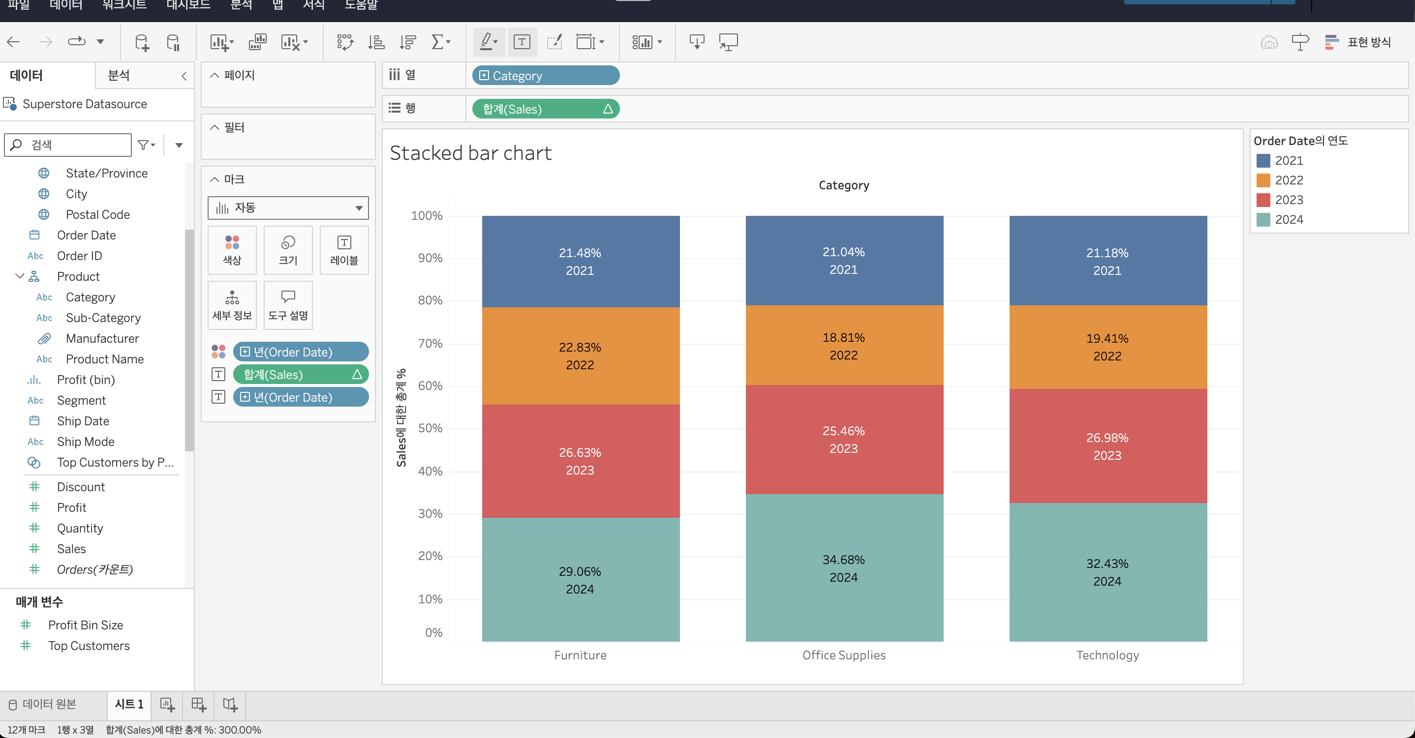
I created a stacked bar chart using the “Superstore Datasource” in Tableau to visualize yearly sales by category. The proportion of sales for each year is labeled, and the colors are used to distinguish between the categories.
I referred to this video for guidance.