Tableau Practice (5)
Quick Table Caculations and Separate Color Legends Example
Tableau - Quick Table Caculations and separate color legends
In this post, I practice how to use Tableau’s Superstore data source to implement Quick Table Calculations and separate color legends.
Start by opening Tableau and importing the Superstore data source.
This dataset contains various information such as Sales, Quantity, Profit, and Discount, allowing for diverse analyses.
To represent the quarter-over-quarter changes as percentages for each measure you can use Quick Table Caculation
- Right-click on each measure and select
Quick Table Calculation>Percent Difference
To visually convey the change rates more clearly, Set a color legend. We can differentiate positive changes from negative ones using two colors.
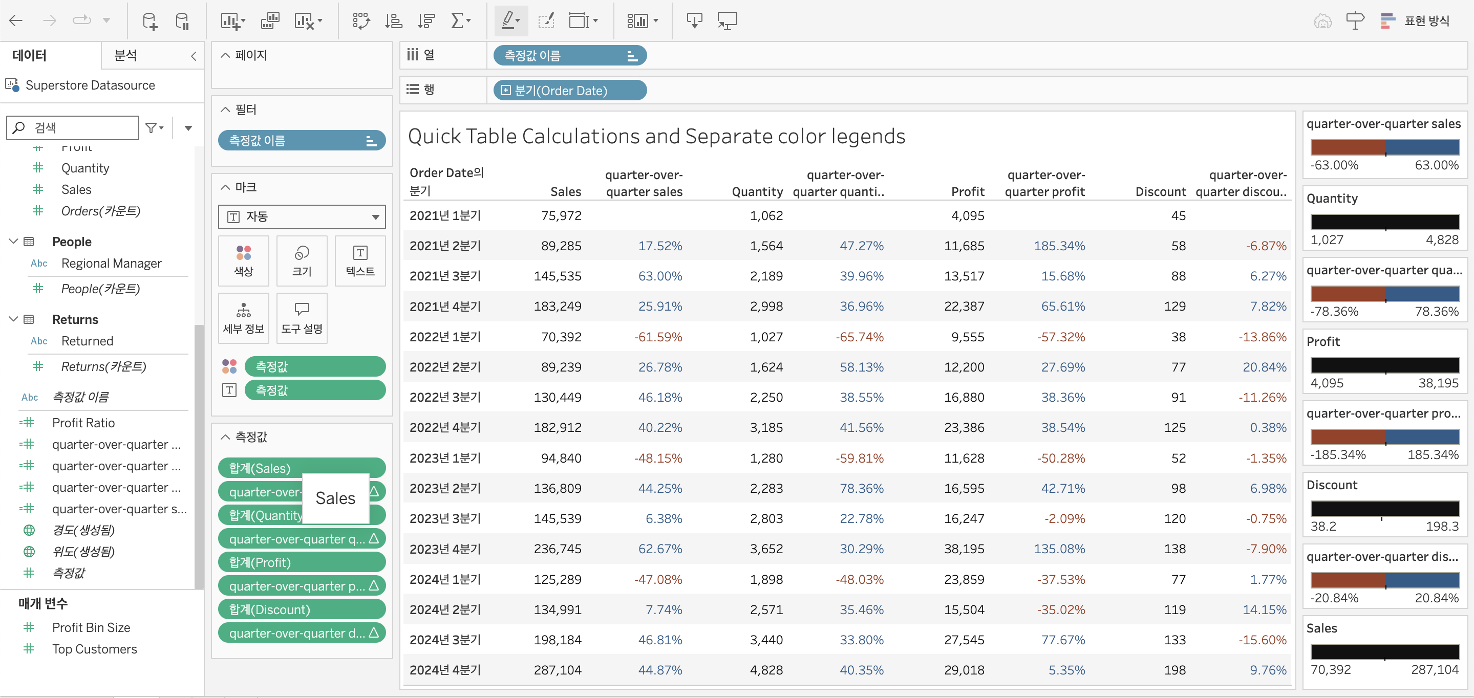
In this example, I tried how to effectively visualize quarter-over-quarter performance using Quick Table Calculations and separate color legends in Tableau.
I referred to this youtube video for guidance.